
MY ROLE
User Research
User Experience
Usability Testing
TIMELINE & STATUS
2 Weeks
Team Members
Individual
OVERVIEW
Enhancing the user experience of LinkedIn premium buying user flow - for the desktop website.
For the evaluation ,I used Nielsen Norman group's 10 usability Heuristics for user interface design.
Further, in order to dive deeper into the research, I conducted usability testing's followed by the solutions, and again usability testing's.
Initial problem discovery
Why LinkedIn premium?
LinkedIn connects over 875 million members worldwide, serving as a key tool for professional growth.
LinkedIn Premium offers essential features that not only help users advance their careers but also significantly increase LinkedIn's revenue, highlighting the service's shared benefits.
Understanding target audience
Who we are trying to solve this for?
When it comes to professional networking and career development, LinkedIn is one of the most widely used social network platforms.
Marking the problem space
How might (LinkedIn premium users) achieve (a intuitive and better experience) so that they can ( take informed decisions while taking premium plans )
Who?
Why?
What?
Current user flow
My preliminary research started with the understanding the business model of LinkedIn and then studying the target users of LinkedIn Premium and evaluating the current user flow.
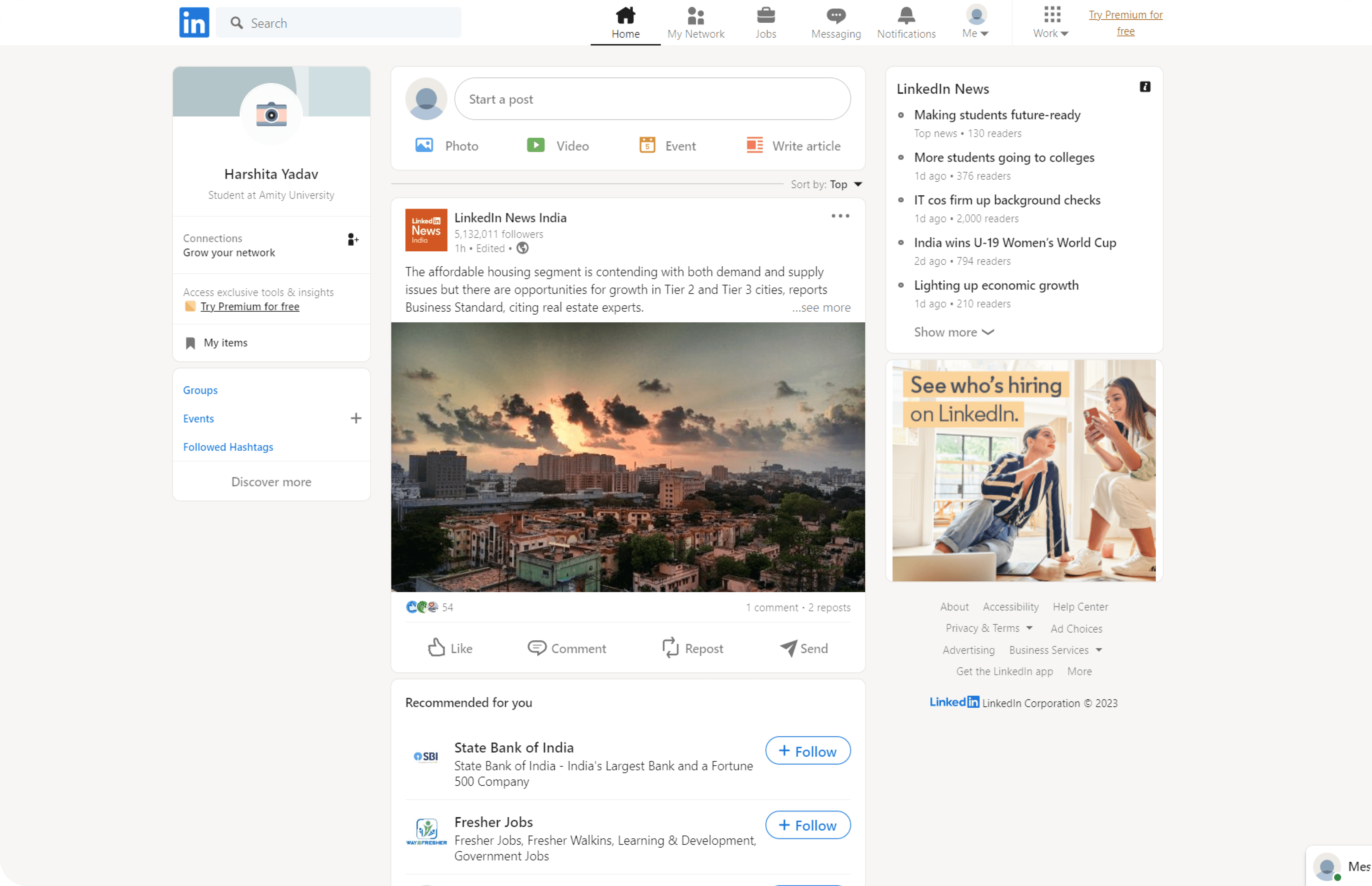
Home Page
Premium Questionnaire
Recommended Plans
Learn more
Checkout
Review your order

Conducting Research
THE FACT STUFF
A total of 39 percent of LinkedIn users pay for LinkedIn Premium, it is estimated that there were 175.5 million premium users on the platform in 2023
STEP ONE : HEURISTIC EVALUATIONS CRITERIA
HEURISTIC EVALUATIONS
I conducted a Heuristics Evaluation of the existing flow and used Neilson Norman Group’s 10 Usability heuristics for User Interface Design.
In addition, I provided personal insights to supplement my evaluation. This helped contextualize the evaluation and ensure a
well-rounded design approach.
01 Homescreen
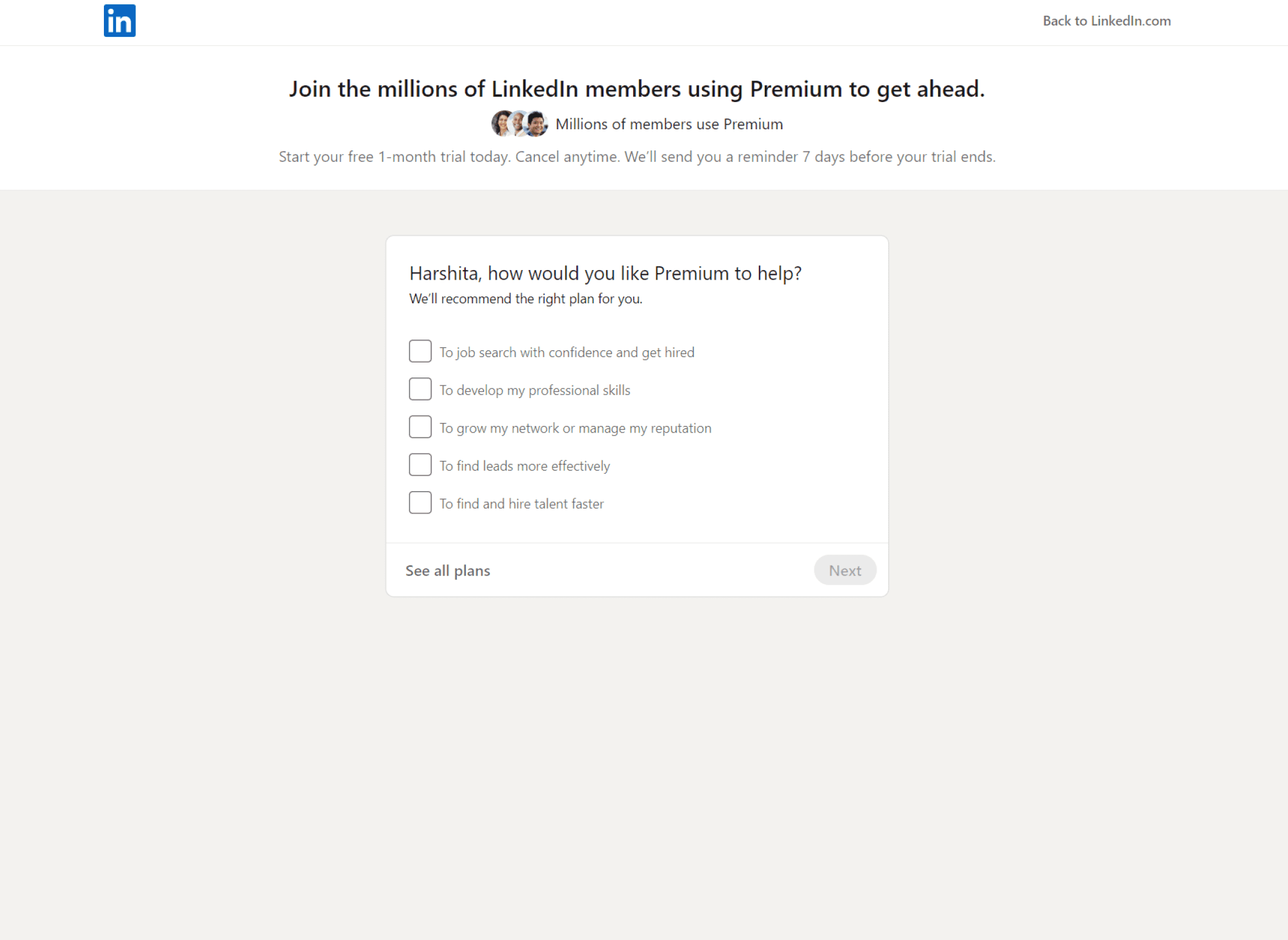
User control and freedom
The users can easily leave the questionnaire and directly see the plans offered through CTA ‘See all plans’.
Lacks Progress Status bar
The LinkedIn Premium subscription purchasing experience lacks a process status bar, which hinders users from easily tracking their progress
No Suggestions
No suggestions according to the user's profile while choosing premium plans initially when they started.
STEP TWO : USER INTERVEIWS
EVALUATING USING USABILITY TESTINGS
I researched to define the target users for the usability testing and gathered information on user's behaviors, pain points, and other insights.
Based on this research, I created an interview guide for task-based usability testing, following the current user flow.


Crafting the Solution
Ideating. Wireframing. Prototype.
After completing the research, it was time to start generating ideas. I began by converting pain points into design opportunities and brainstorming potential solutions to address the identified issues.

the iterations....
Reusability Testing's
After prototyping the redesigned flow, I conducted user tests to verify if the project goals were met.
For Usability testing, I prepared tasks for the users to complete and also attempted to observe the user, focusing on the user’s direct intention and behavioral insights and conducted five re-usability tests using this testing guide.
The feedback gathered from the tests provided actionable insights, which led to changes in the user flow.
What I was testing for
How users are responding to two variations of the landing page for the premium plan to identify which one is preferred.
Gather qualitative data on user understanding, opinions, and perceived relevance of newly added or improved features such as the system status bar and the plan comparison option.
Evaluate how effectively the new features are engaging users and influencing their decision-making process regarding the premium plan
A/B Testing

3/5 users find it more engaging as they are paying more attention to this layout and find it more interesting

Users find it monotonous and find difficulty to stay till the end of the page

Users find it monotonous and find difficulty to stay till the end of the page
01 Landing page layout
A/B testing revealed that a Z-pattern outperformed the first layout in terms of user engagement.
Before

After
02 Visibility of system status bar
The visibility of the system status bar has been increased by incorporating step labels directly into the bar. Clear and concise labels have been provided for each step to help users understand their current position in the process and what steps remain.
Before

After

The Solution
01 Introducing a landing page for LinkedIn Premium
This landing page clearly explains the benefits of LinkedIn Premium, displays all plan options upfront, and allows users to understand the platform better and compare and contrast plan features before making a decision, leading to customer satisfaction and a more positive user experience.
Before

After
02 Progress Status Bar
A progress status bar is added that provides users with a clear visual representation of their progress in the subscription process, reducing uncertainty, anxiety, and frustration and helping them complete the task efficiently.
Before

After

Progress Status bar
The process status bar will provide a clear indication of the task's progress, ensuring that users are aware of the status of their activity. This will improve user visibility and enable them to complete their tasks with ease and confidence.
Back Button
The users can easily leave the questionnaire and directly see the all plans offered.
03 CTA for Comparing Plans
After completing the questionnaire or getting the recommended plans, a CTA for comparing plans is added.
So that the users could view a side-by-side comparison of the various plans, which would enable users to quickly and easily identify the essential features and make an informed decision about their subscription.
Before

After

Compare Plans for Informed Subscription Decisions
Added a CTA for comparing plans after completing the questionnaire or receiving the recommended plans.
This helps users to perform a side-by-side comparison of various plans and help them quickly and easily identify the essential features and make an informed decision about their subscription.
04 Providing feature information and feature availability
By providing transparent and comprehensive feature availability information, users can better understand what the product offers and choose the plan that suits them best.
Before

After

Providing Feature Information
Added hover feature to display additional information about unfamiliar features. This provides a quick and effortless way for users to access more details about features they may not be familiar with."
Providing Feature Availability Information
When users hover over an unavailable feature in a specific plan, indicate in which plan the feature will be available. This helps users decide which plan to choose and avoid any ambiguity or uncertainty about feature availability.

05 Introducing UPIs and flexible billing plan
By introducing a quarterly plan and a UPI payment option in the payment section, users will have the flexibility to use the premium service for a shorter period and pay accordingly rather than being limited to only monthly or annual billing options.
Before

After

Introducing Quarterly Plan for Flexible Premium Billing
The quarterly plan will allow users to use the premium service for a shorter period and pay accordingly rather than being limited to monthly or annual options, providing greater flexibility and affordability.
Introducing UPI Payment Option
This will improve user experience and satisfaction, while also making our platform more accessible to a wider range of users who prefer UPI as their preferred payment method.
Targeted User Impact
Reduced cognitive load
The design eases comparisons among various plans, reducing cognitive load for users. This is likely to lead to higher customer retention.
Optimized checkout
process
The checkout process has been aligned with the most preferred payment methods by users, reducing customer dropout during the payment process.
Increased LinkedIn
premium accessibility
By aligning plan durations with user needs, LinkedIn Premium's accessibility has been increased, thus expanding the total addressable market for the product.
I'm thrilled to see that some of the suggestions from my LinkedIn case study have come to life on LinkedIn Premium! Go check it out.


